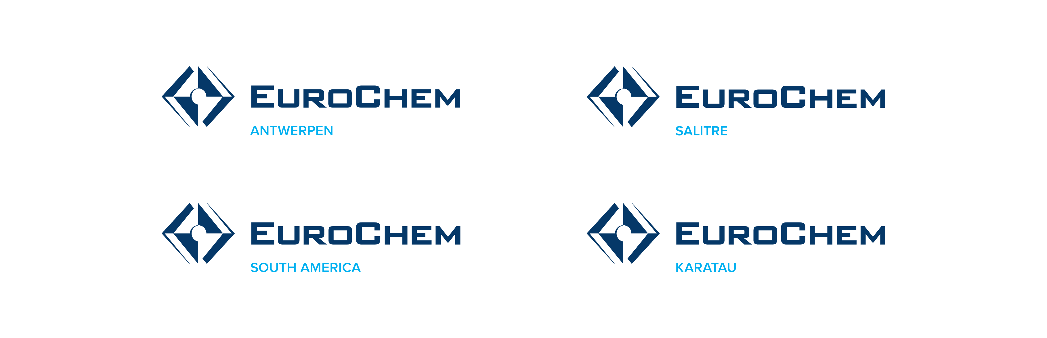


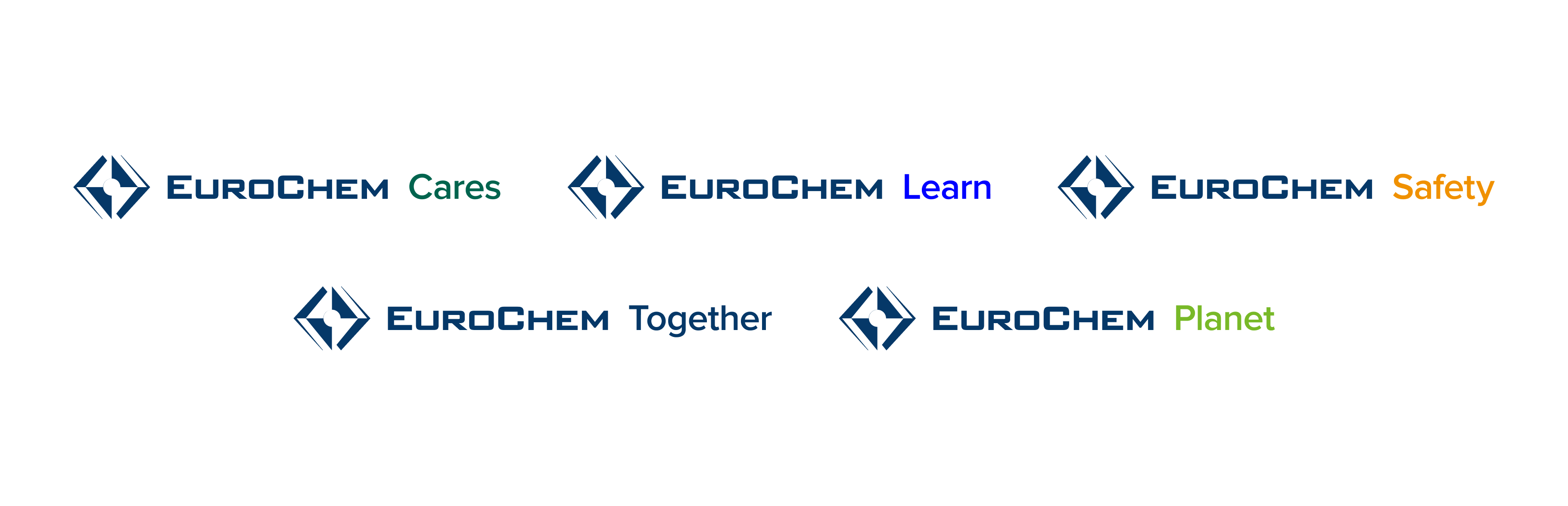

Main headline with emphasis on key message

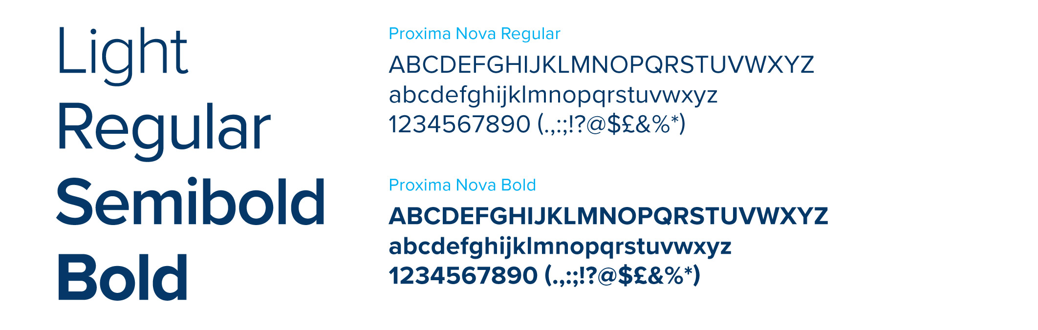
EuroChem corporate identity guide
This Guide helps to communicate visually and demonstrates the character of our brand. It is a simple set of rules and recommendations that help us to create a clear, unified image that is understandable to all audiences.